Time frame : 12 Months My role : Creative Direction, content synthesis, UI, UX, infographic design Partner : Funded by the BC Ministry of Health and created by pain BC in partnership
Project Introduction
Live Plan Be+ is an online self-management tool for people with chronic pain. Live Plan Be+ aims to aid individuals by offering resources for online learning, creating a personalized flare-up plan, and setting achievable goals to promote a better understanding of their condition and enhance their overall well-being.
Chronic pain affects all age groups and can occur anywhere in the body. It can range from mild to severe pain that interferes with daily activities. The symptoms of chronic pain can cause other health problems such as anxiety, trouble sleeping, and a weakened immune system.
Research has shown that pain self-management programs are effective in reducing pain levels and improving patients’ well-being. Though, there are barriers to these programs such as waitlists, costs, and being unavailable in remote rural locations. This leads to many patients having access to pain self-management programs until much later in their conditions, or not at all.
The project partner, Pain BC is a non-profit organization innovating care systems to improve well-being for people living with pain through technology-based care. The Digital Lab partnered with Pain BC to create accessible treatment for chronic pain management.
Ux research & Ideation
Target Users
Individuals who experience chronic pain
Individuals who cannot easily access healthcare for their symptoms.
Individuals who want to enhance their overall well-being
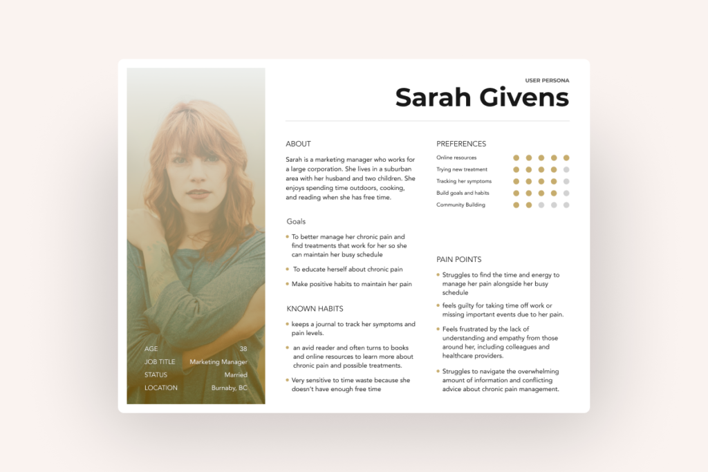
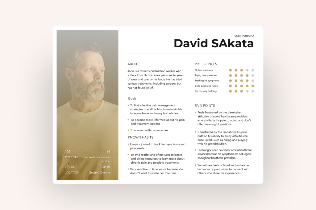
User Persona
We developed two personas to understand the user group. Developing two personas with different backgrounds, ages, and interests helped us better understand the user’s perspective.
Persona 1: Sarah, 38 years old
Background: Sarah is a marketing manager who works for a large corporation. She lives in a suburban area with her husband and two children. She enjoys spending time outdoors, cooking, and reading when she has free time.
Persona 2 : David, 65 years old
Background: David grew up in a rural area and worked as a construction worker for most of his life. He is retired now and lives with his wife in a small town. He enjoys spending time outdoors, working on his garden, and playing with his grandchildren when they visit.
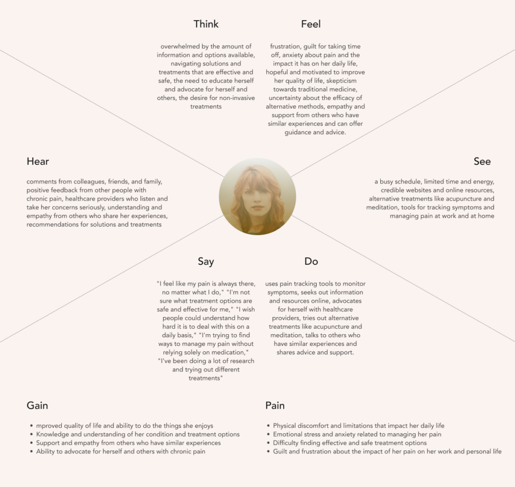
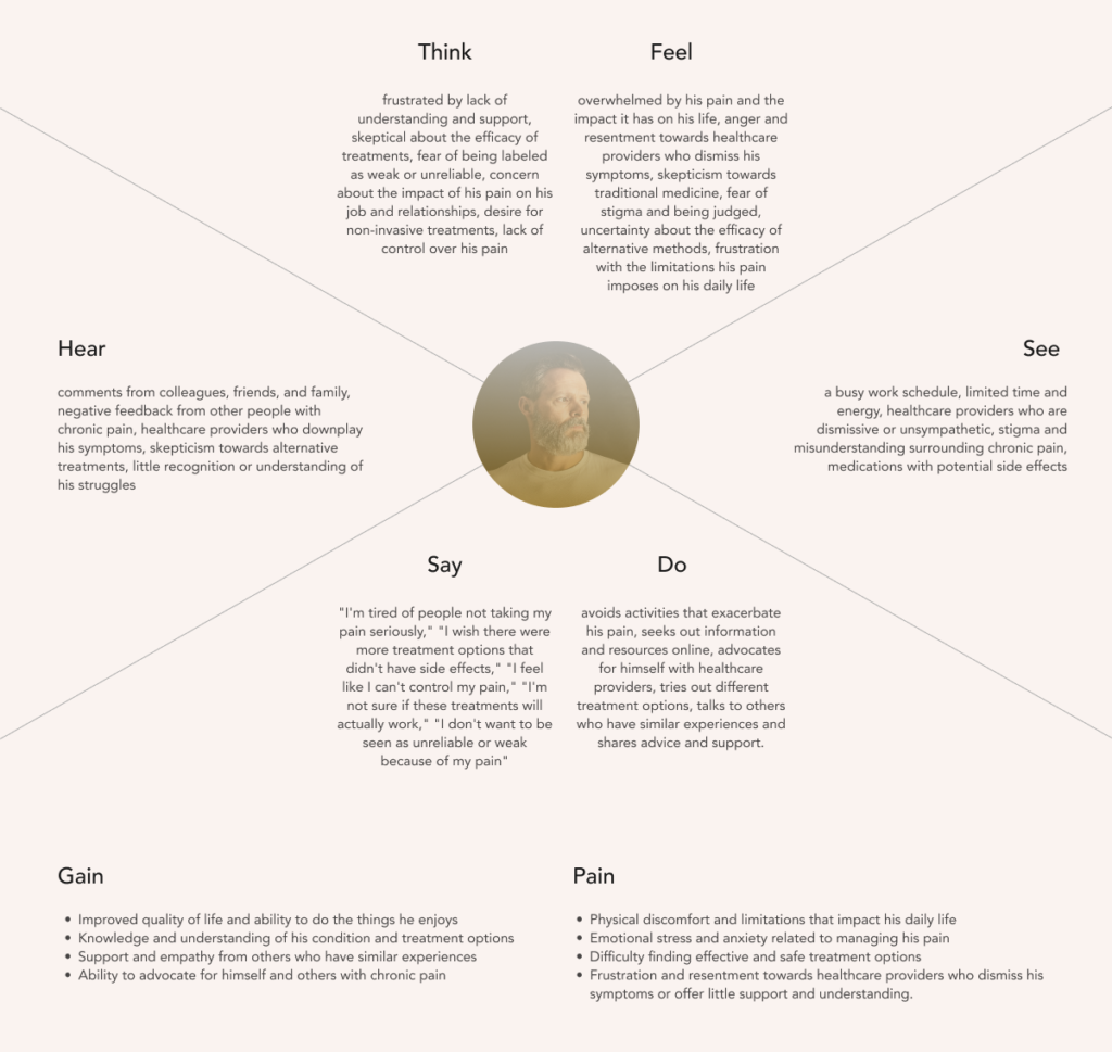
Empathy Map
We also created an Empathy Map to understand the persona’s thoughts, feelings, and the environment around them,
Problem Statement
We were focused on how we could translate this complex long-term situation into an easily-digestible public outreach product.
How may we deliver easy-to-digest information so that learners are not overwhelmed?
How may we encompass a wide range of learning styles so that learners with shortened attention spans and reduced ability to focus stay engaged?
How may we keep users building their goals so that they can make their habit?
How may we prepare the users in case they have a sudden outburst of pain?
Information Architecture
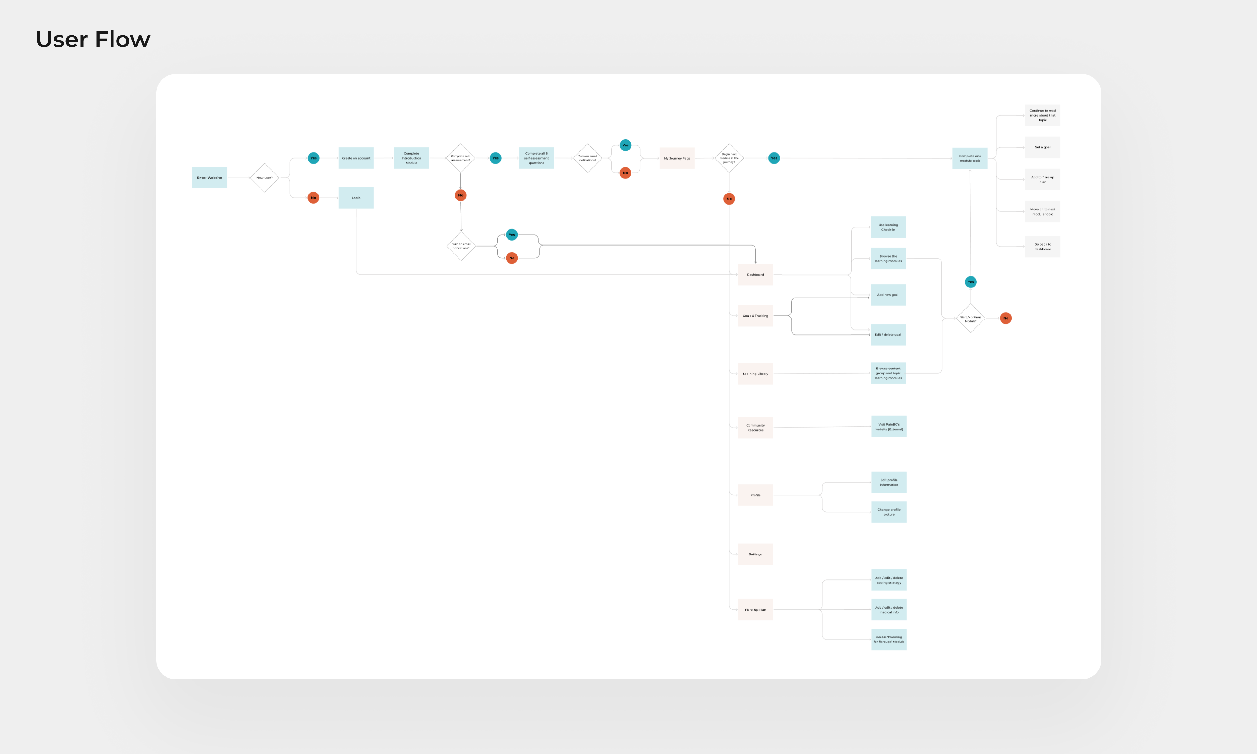
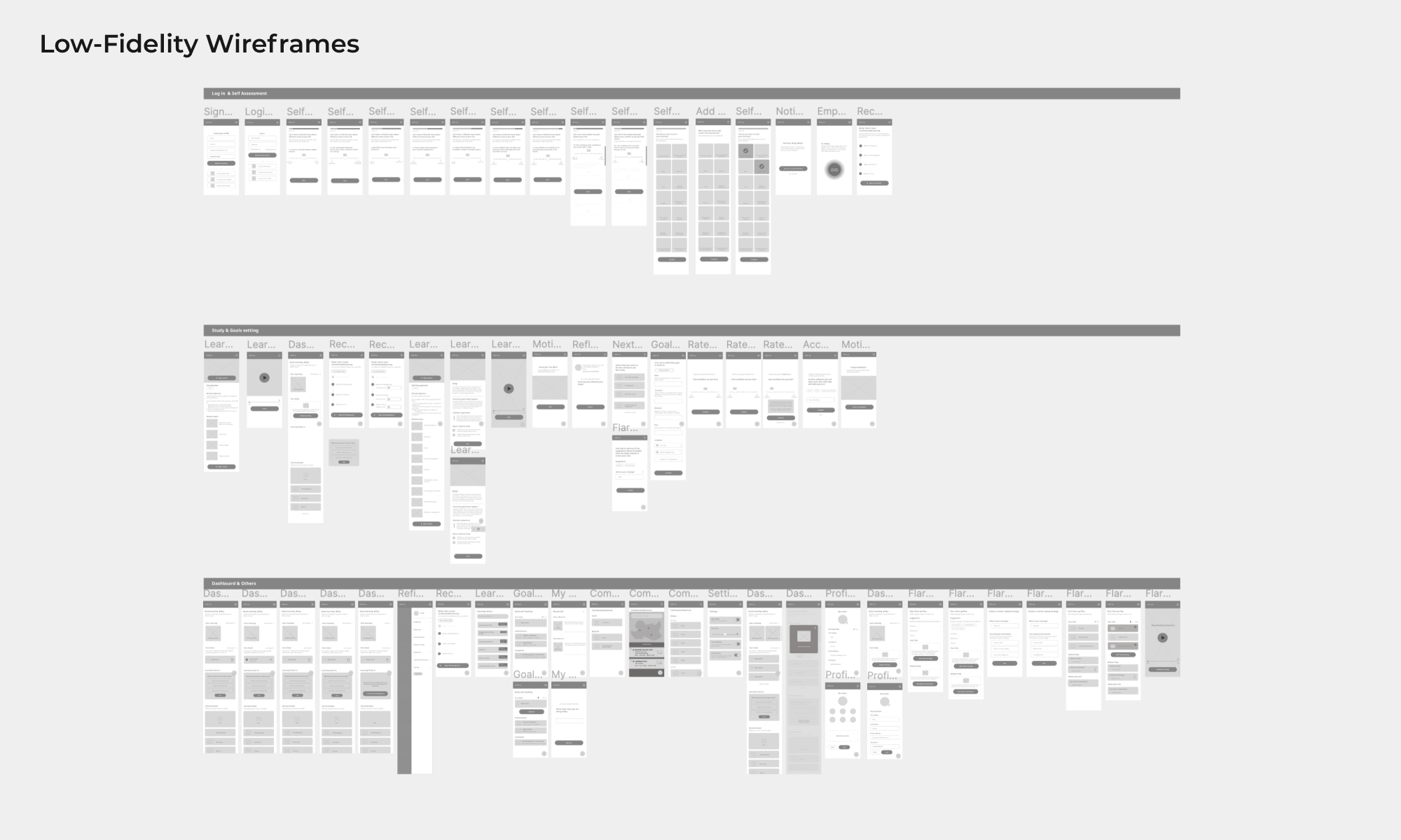
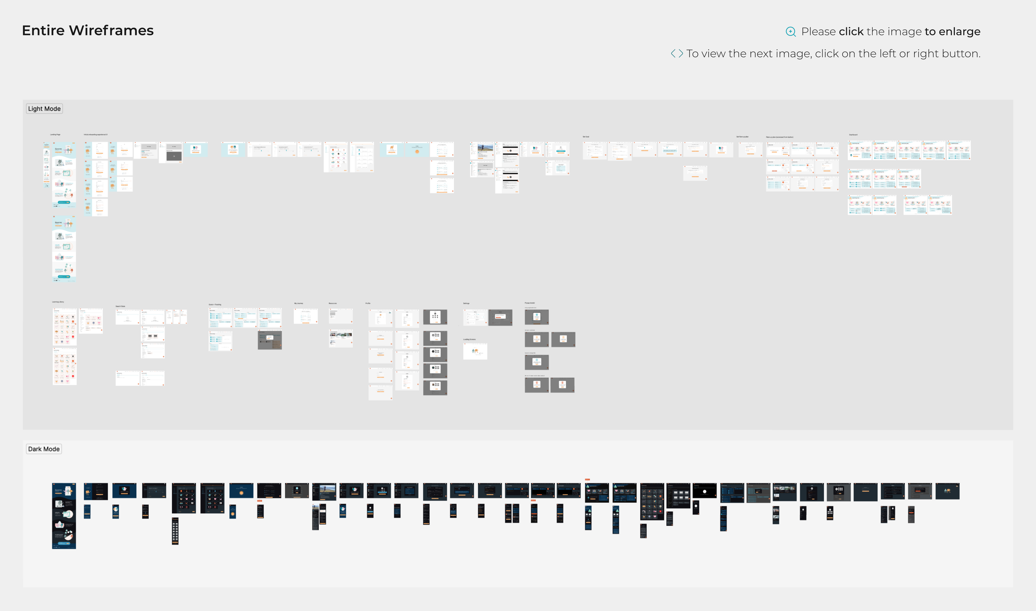
Lo-fi Wireframes
With the initial UX research and planning complete, we created a site map to outline the key pages for the MVP. Then we outlined the users flows (and various task flows within) to see the UX flow in bird eyes view.
Final Features
Through a rigorous information architecture process, we developed multiple iterations, and ultimately identified three key features.
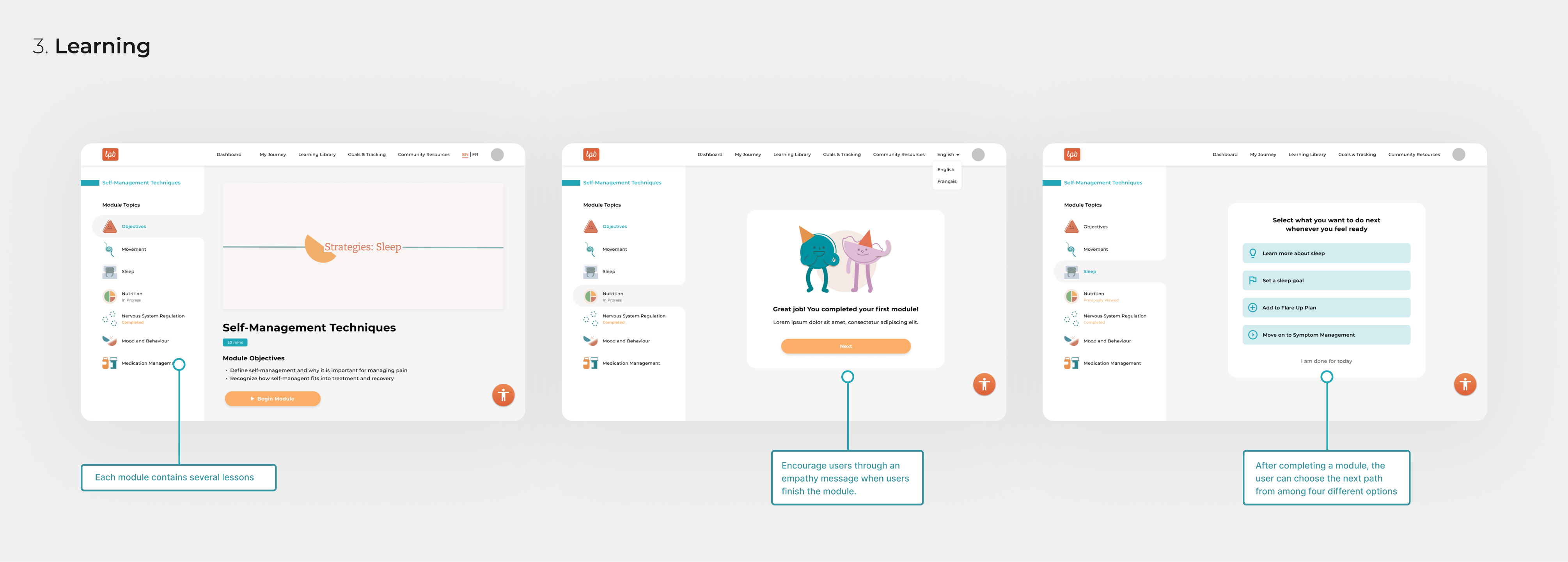
Through online learning, users can gain a comprehensive understanding of chronic pain and learn effective ways to improve their quality of life.
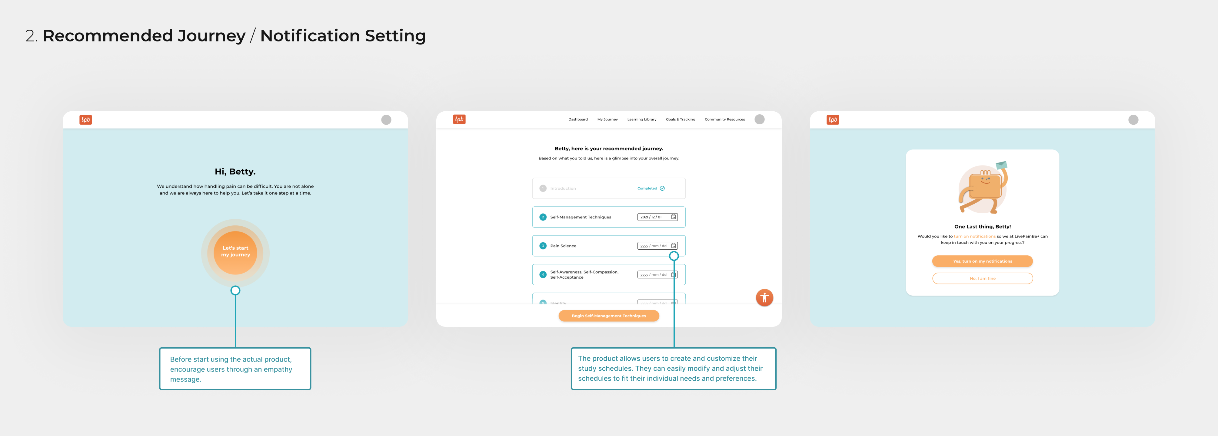
By setting up their own study schedule and goals to enhance their daily routine, users can take charge of their lives and boost their confidence.
With easy access to the Flare-up plan button, users can stay calm in emergency situations, following a pre-established plan to overcome any obstacles.
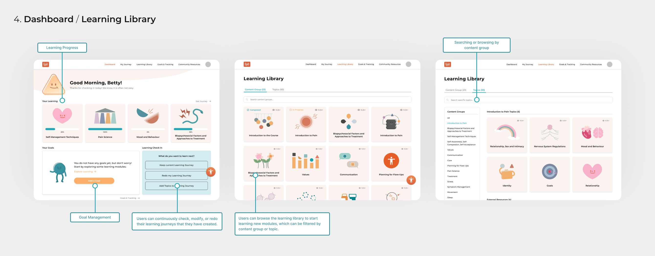
The site provides users recommendations, pain response support, health education, and clear action plans to help manage their pain. It also connects users to local healthcare providers.
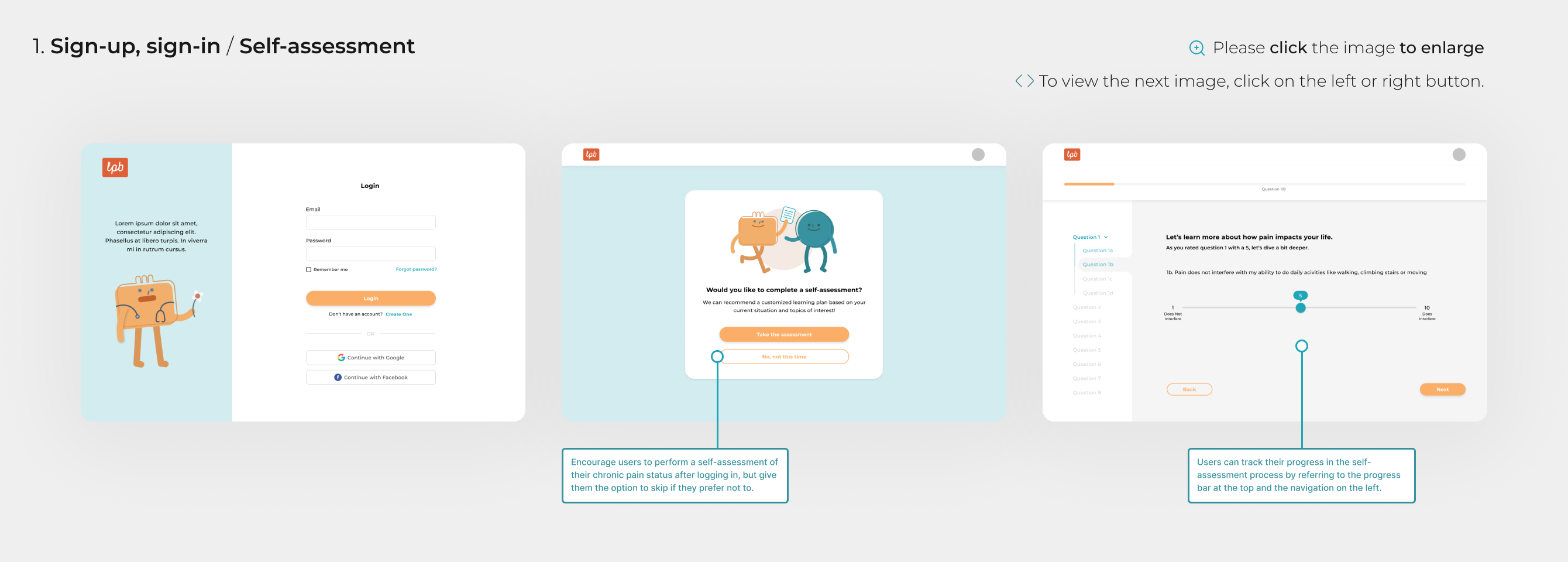
When a user signs up for the platform, they will complete a self-assessment and receive personalized resources based on their condition. Users will have access to a dashboard containing features such as pain self-assessments, lists of useful resources, their action plan, other learning modules.
There are 45 learning modules for users with animated videos to explain relevant medical information in simple key concepts. They include research-based topics on managing thoughts and moods, goal setting, monitoring symptoms, and navigating stigma in healthcare. There are lessons on decision-making for sleep, nutrition, stress management, and exercise to reduce pain. It also explains health education, the experience of pain, the nervous system, and the brain to help patients understand their condition better.
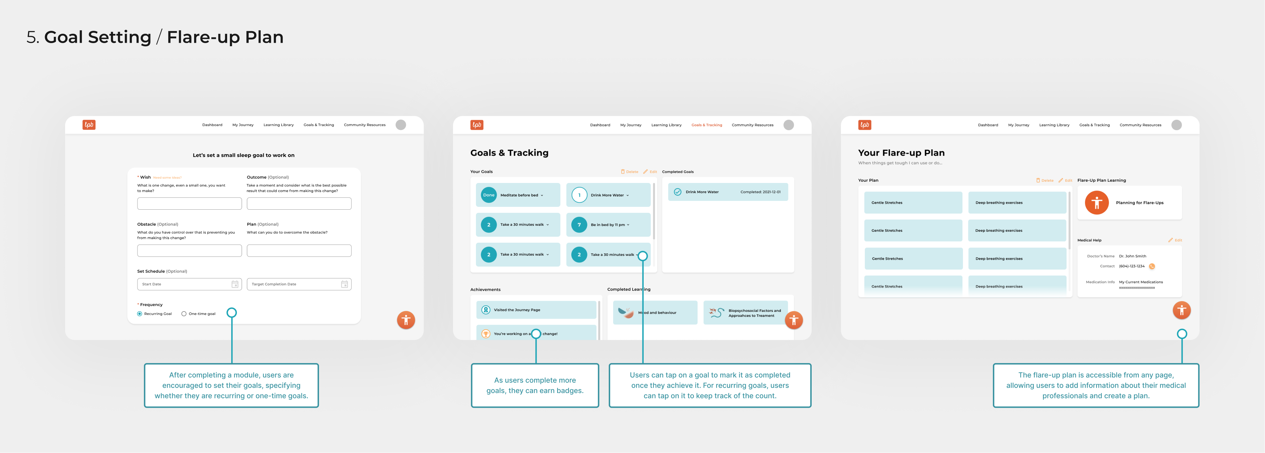
Users can set management strategies during pain flare-ups and goals for an action plan. Based on their location, patients can find support resources in their area and contact their primary healthcare team for easy communication.
Branding
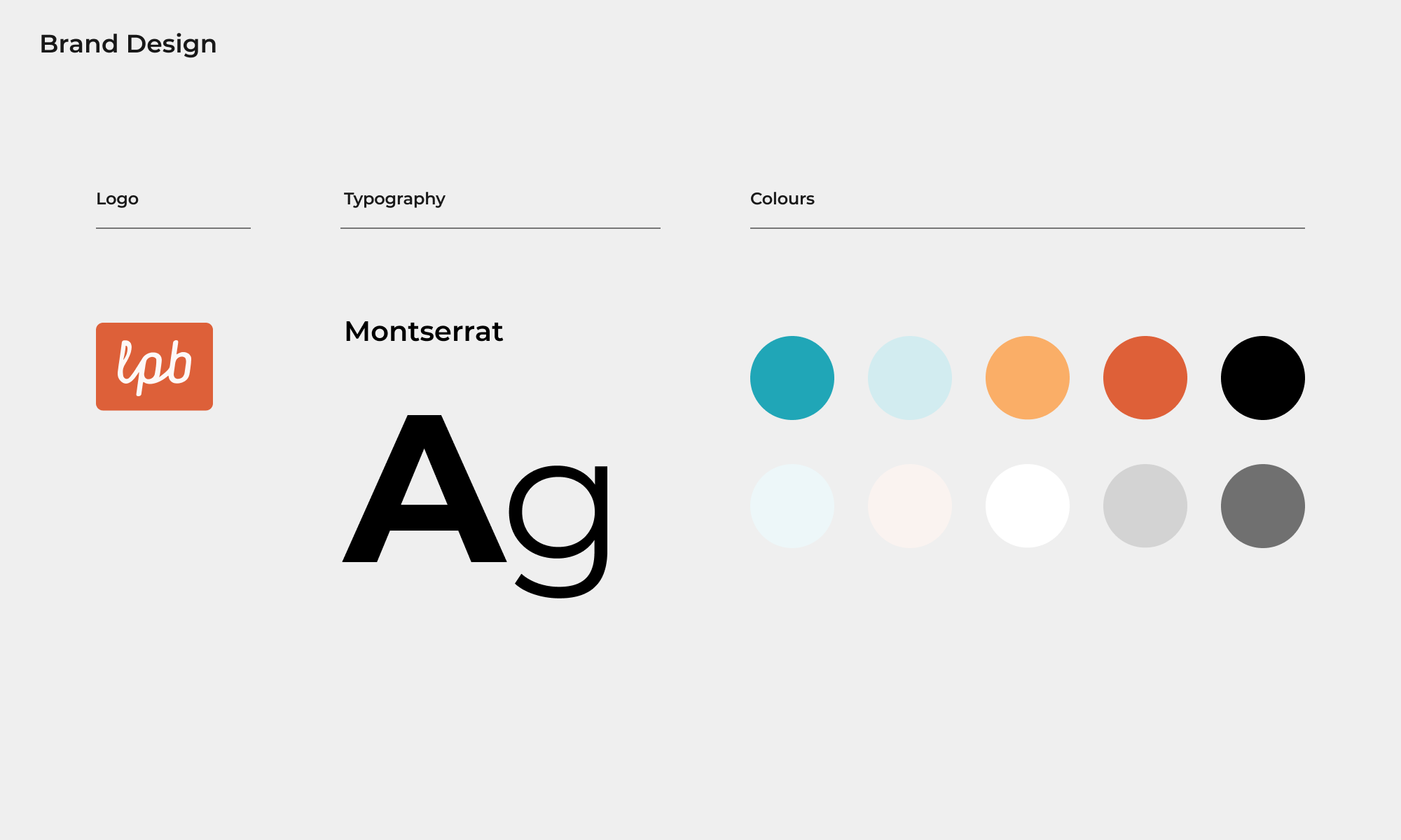
Branding
To create a cohesive and visually appealing brand, we aimed to evoke a sense of calm energy through the use of soft colours. Our goal was to convey a positive and inviting atmosphere while maintaining a comfortable and approachable aesthetic in our visuals.
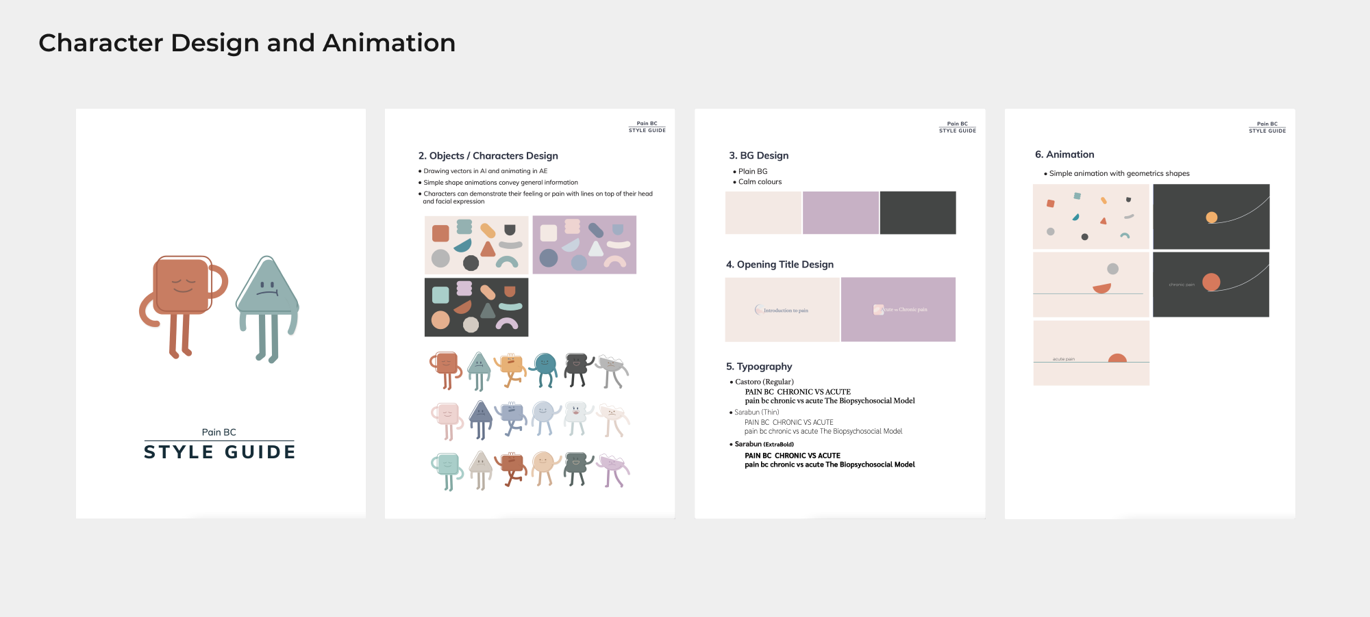
Character building
Our collaboration with the Digital Lab’s exceptional media team resulted in the creation of captivating and distinct characters, as well as dynamic animations, which have become integral design components of the entire application. Through our joint effort, we were able to bring our vision to life with a creative approach that combines functionality and aesthetics. The media team’s expertise in animation and visual storytelling allowed us to elevate the user experience, making it both visually appealing and engaging. The incorporation of these key design elements not only adds an extra layer of enjoyment for the user, but it also contributes to the overall success of the application, making it stand out in a crowded digital landscape.
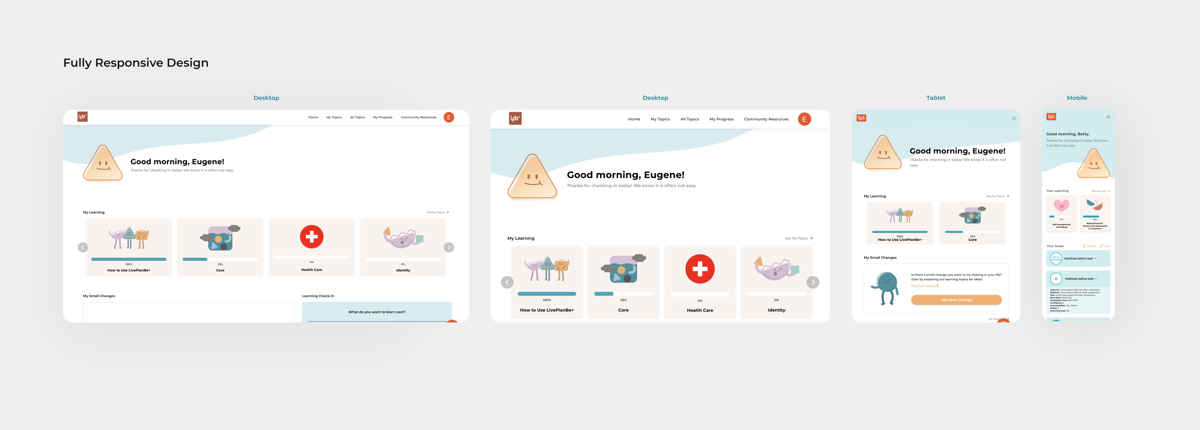
Hi-fidelity wireframes
Hi-fidelity wireframes
We build hi-fidelity wireframes. We focused on building wireframe for each task to check the flow and at the same time try to make entire system cohesive.
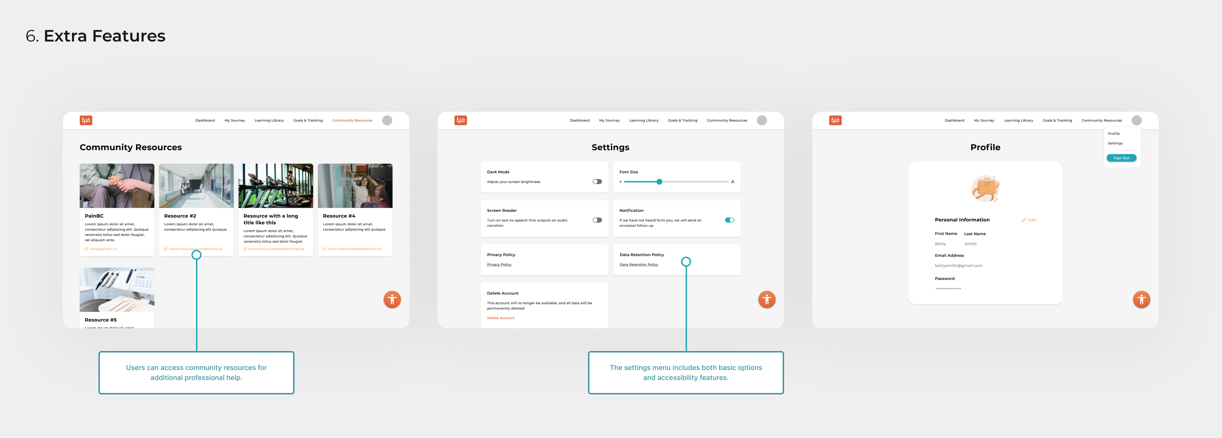
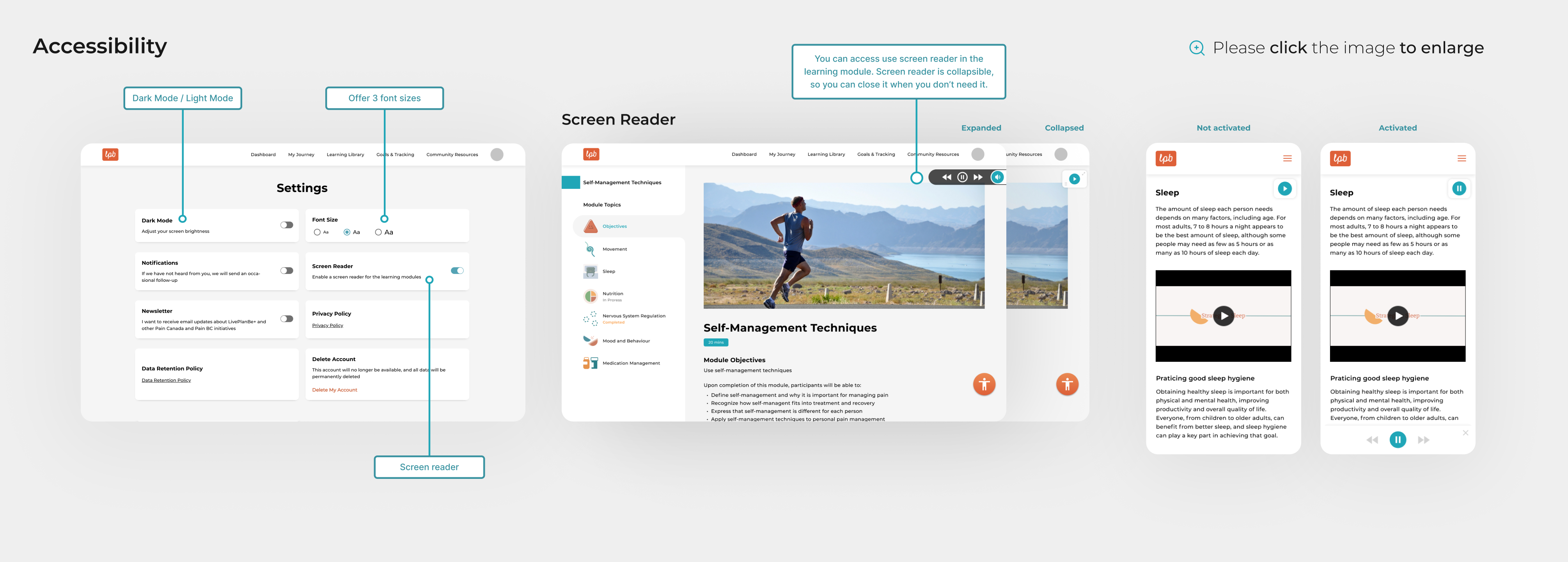
Accessibility
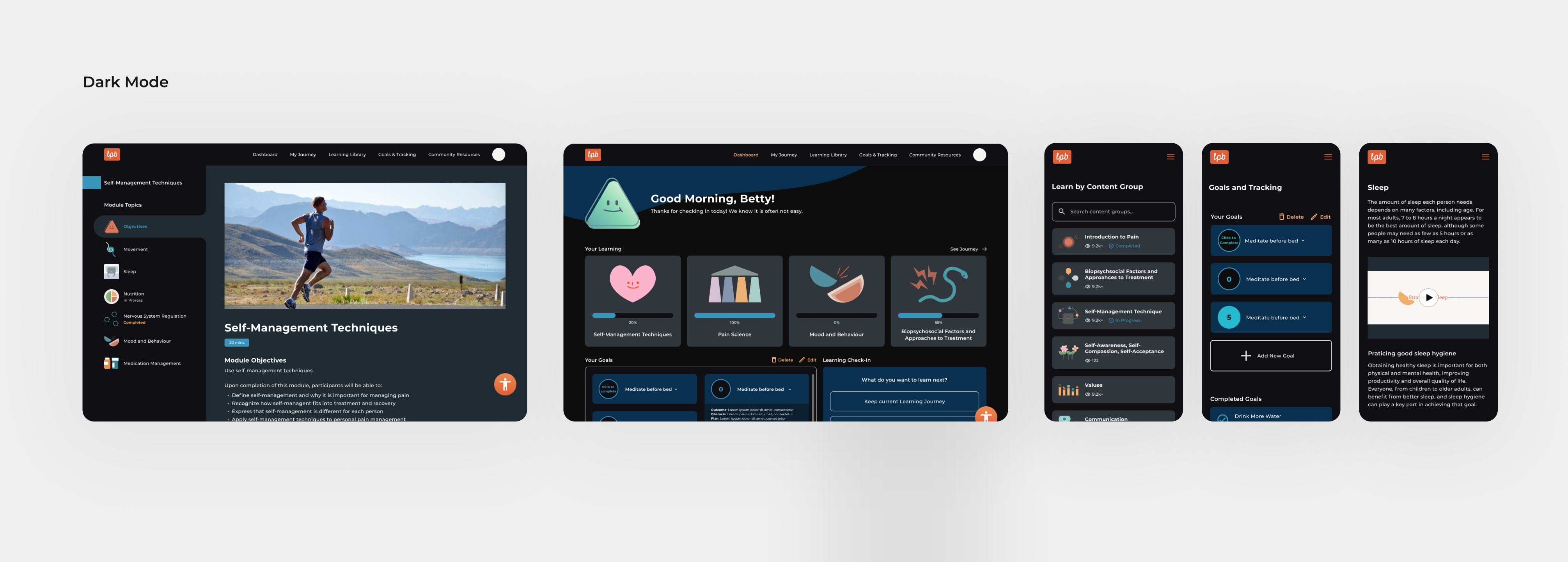
The user group of this product included people of all ages, but vulnerable groups such as the elderly were the main users. Therefore, we designed various features with accessibility in mind. First, we provided three font size options to consider the elderly, and we also added a reading feature to the learning modules to accommodate people with visual impairments or difficulty reading.
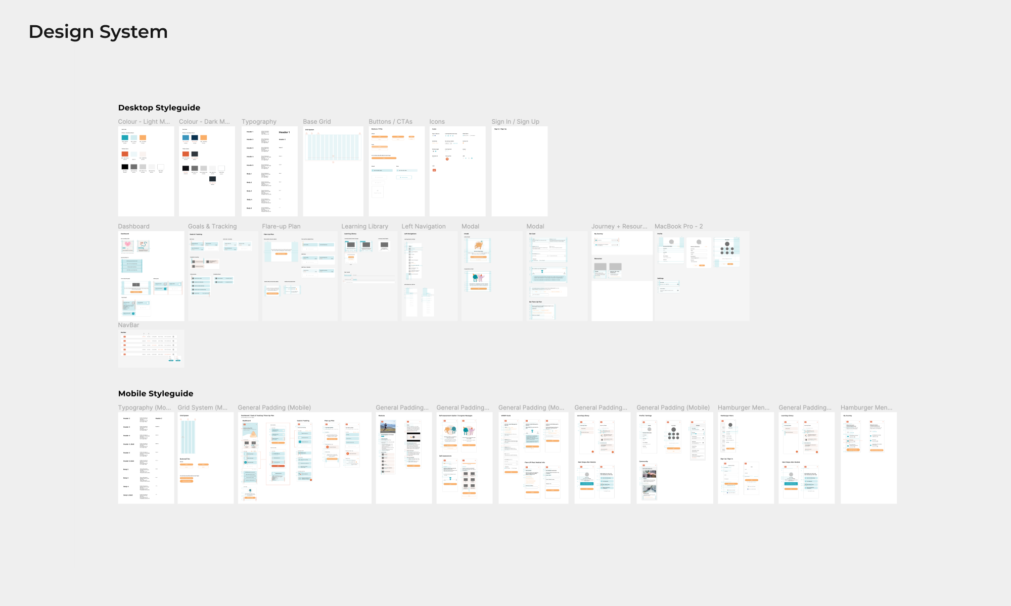
Design System & Style guide
Additionally, we created a consistent and systematic design style guide. This style guide improved communication with the development team and provided the design team with the opportunity to refine the design system with greater attention to detail.
Conclusion &Reflection
With Live Plan Be+, people with chronic pain can coordinate an effective healthcare plan specific to their needs. Patients have easy access to support during times of pain, no longer experiencing limitations of time, location, or availability of in-person programs. Patients become more engaged in their treatments, understanding what they need help with and where to receive it. As chronic pain is a persistent condition, Live Plan Be+ stands as a digital health solution ready whenever a patient needs it, encouraging them to make healthy decisions for their well-being.