BCCH Digital Lab
Time frame : 10 Months
My role : Brand Design, UI, UX, illustration
Designer : Eugene Park, Jenny Cai, Chantal Hwang.
Project Introduction
Digital lab aims to improve child health through digital innovation and technology. As a lead designer of the UX/ UI design team, I designed digital lab website & brand renewal project.
Background
The main reason for our design renewal was the rapid growth of our digital lab. Within a mere three-year timeframe, our team grew from a modest 10-member outfit to a thriving cohort of over 40 individuals. Correspondingly, our portfolio of projects saw a significant uptick in volume. Unfortunately, our previous website failed to keep pace with this growth trajectory and could no longer serve as an adequate representation of our capabilities.
So, we embarked on a website redesign initiative to more accurately reflect our status as a dynamic and innovative digital lab.
1. Our aim was to create a website that would effectively showcase our expanded range of expertise and foster greater engagement with our audience.
2.We also updated our brand’s visual identity, which included our logo, colour palette, and illustration and graphic style.
Previous Design
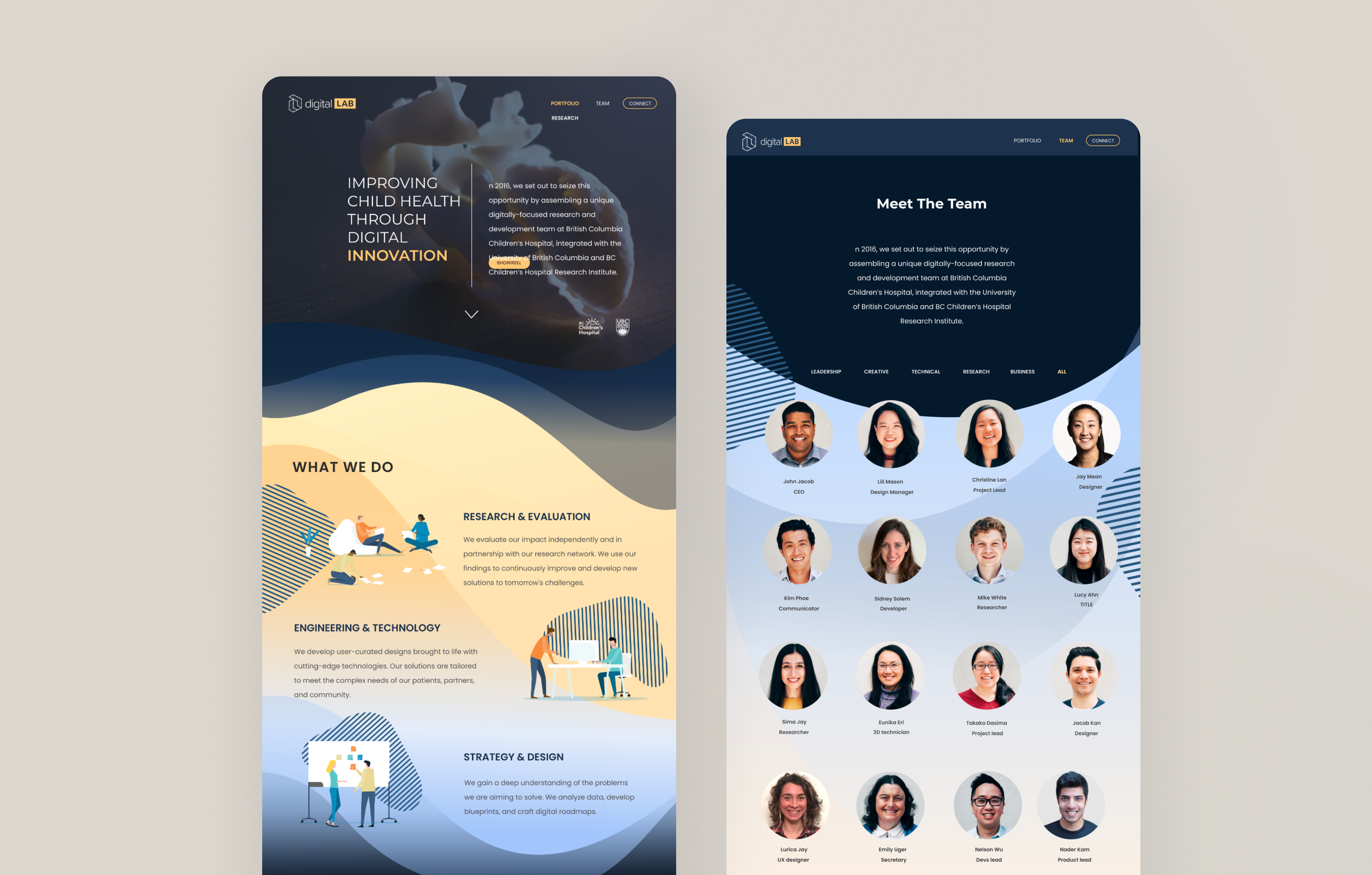
The existing design was a dark mode website with a combination of navy, light blue, and gold colors. However, the wave and stripe patterns gave it an outdated feel, and there was a lack of interaction in team and portfolio cards. The logo also needed an update, and there was a lack of consistency in icons and illustrations.
What we designed
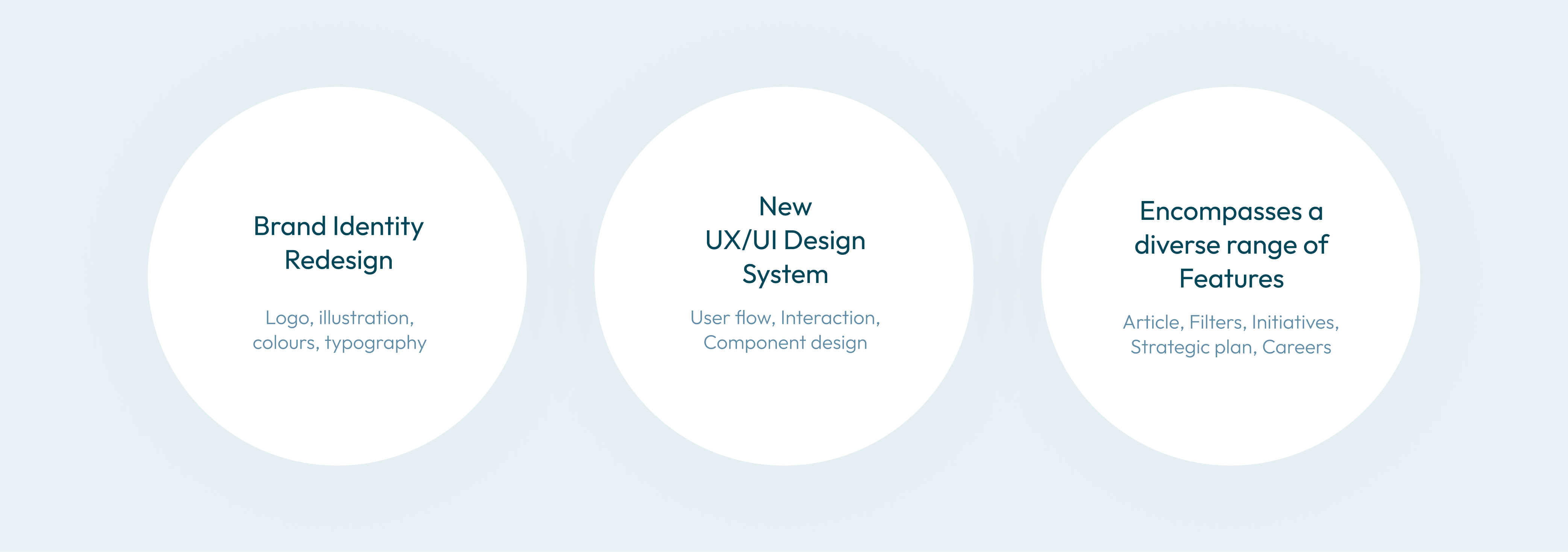
What we designed
Our design upgrade was comprised of three main parts.
Firstly, we prioritized rebuilding the brand identity as a fundamental element of renewing the website. This involved updating the logo and creating a cohesive design language that would be carried throughout the site.
Secondly, we crafted a new UX/UI design system that incorporated the new brand design and design components, resulting in a streamlined and user-friendly experience for visitors.
Lastly, we incorporated a diverse range of new features that showcase Digital Lab’s capabilities, such as articles, filters, initiatives, strategic plans, and more. These additions bring a dynamic and engaging dimension to the website, further enhancing the user experience.
Brand identity redesign
Logo, Typography, Colours
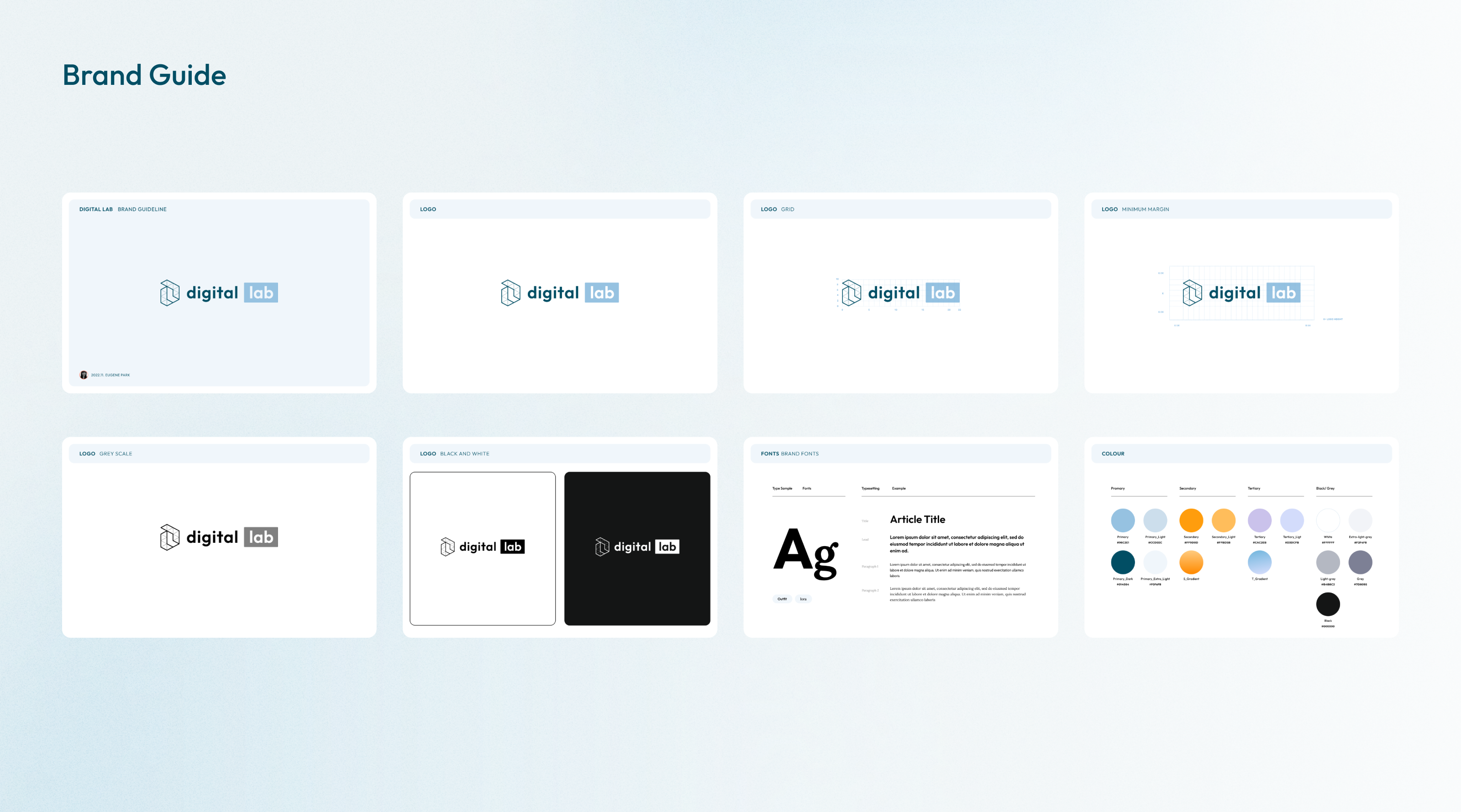
To kick off the website renewal process, I began by designing a basic brand identity that included a logo renewal, typography, and a color system. For the typography, I opted for the modern Outfit font, which gives off a contemporary yet inviting vibe. As for the color system, I retained the yellow-gold tones of the previous design while incorporating a new color theme to add a fresh twist.
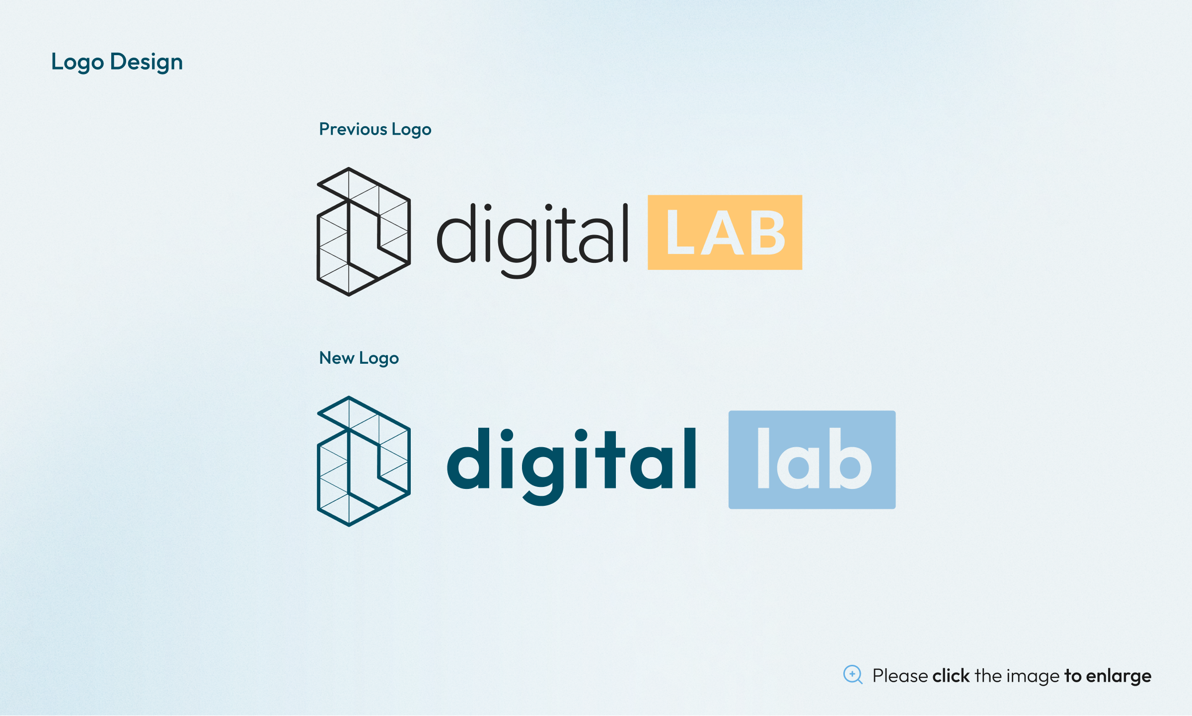
When it came to renewing the logo, I made sure to maintain the core brand identity by retaining the symbol and box shape. However, I upgraded all the other elements to give it a more modern and polished look. This approach ensures that the brand’s identity remains recognizable while giving it a much-needed facelift.

illustration
Creating an illustration style that carries the brand identity is essential to ensure a consistent visual language throughout the website. To achieve this, we began by analyzing the brand’s existing design elements, such as the color palette, typography, and logo. This allowed us to develop an illustration style that would complement and enhance the brand identity.
The visual identity should tell a story about your brand. Think about the message you want to convey and how your visual elements can help communicate it.
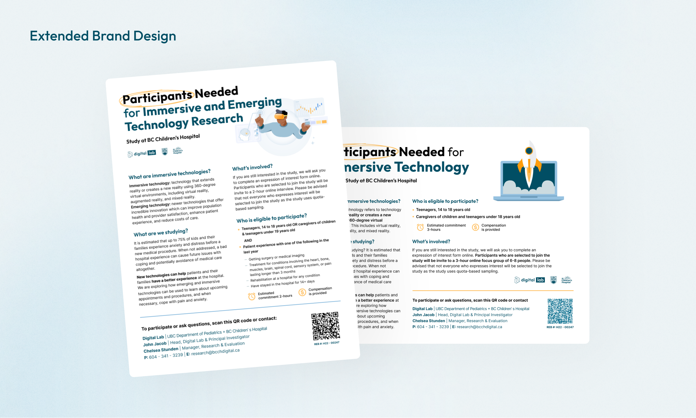
Extended brand design
We make sure that all of visual elements are consistent across all of the marketing materials. This includes the website, social media accounts, poster, and any other platforms where the brand is visible. Consistency helps build brand recognition and increases trust with your audience.
New UX/UI DEsign for digital Lab
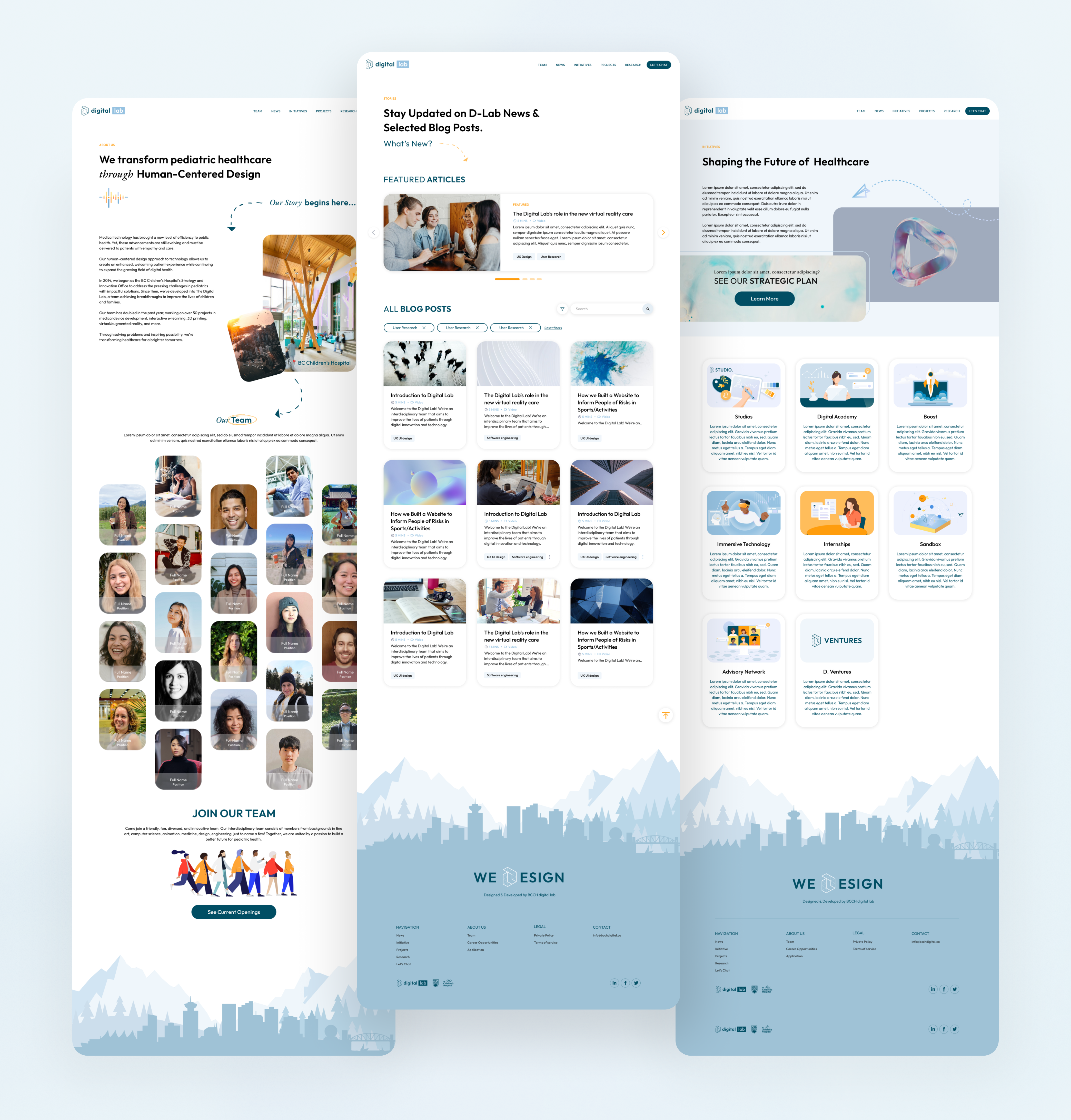
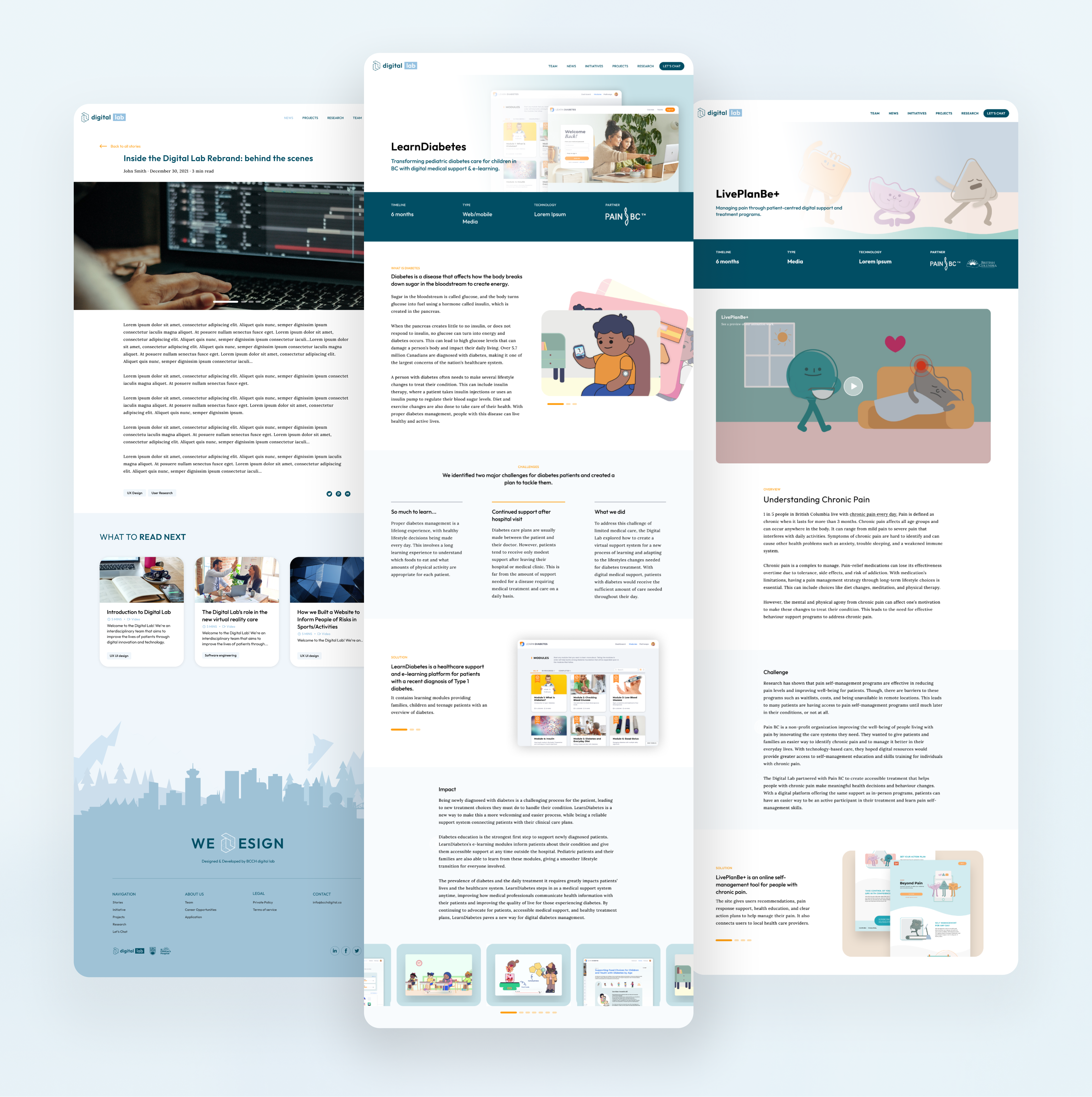
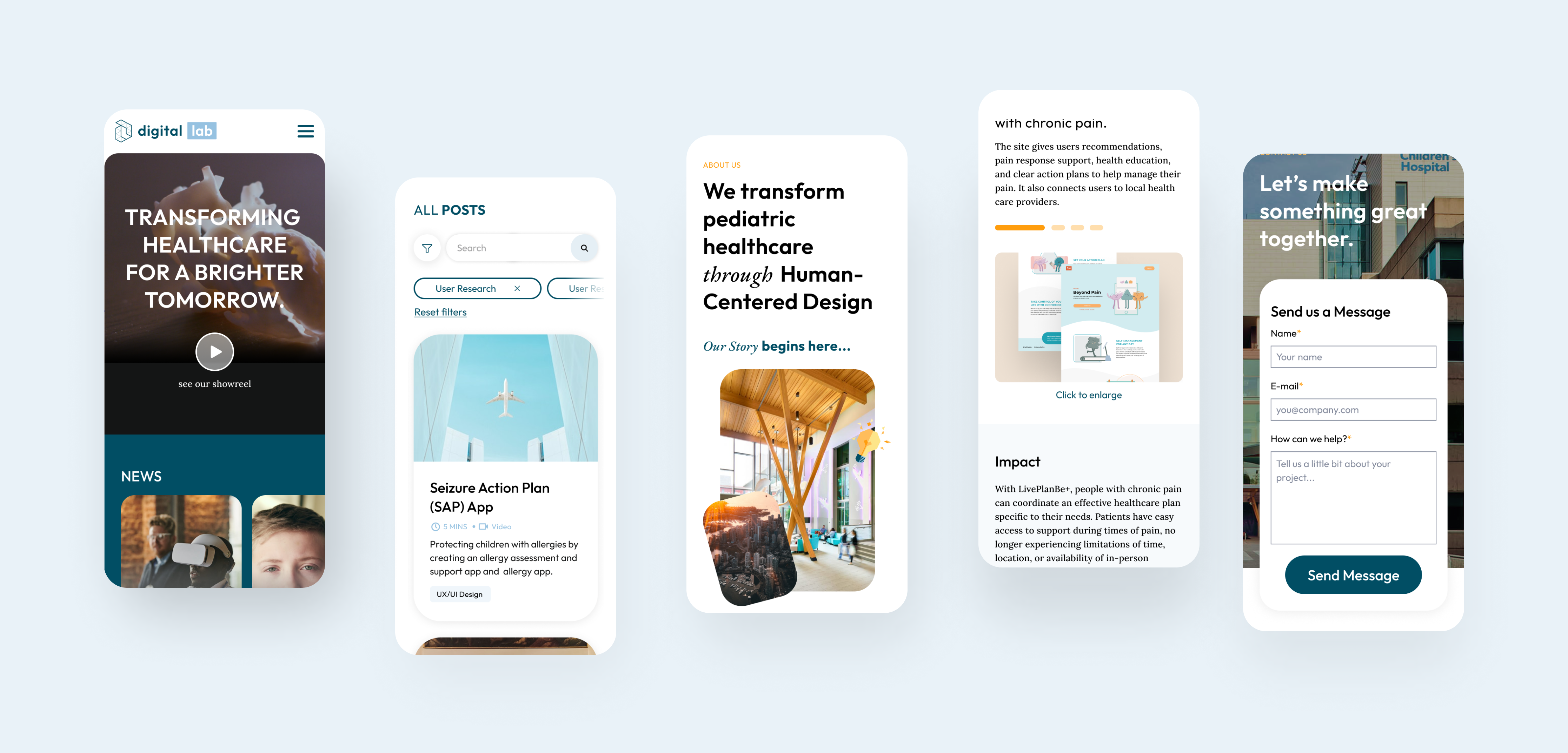
Hi-fidelity wireframes
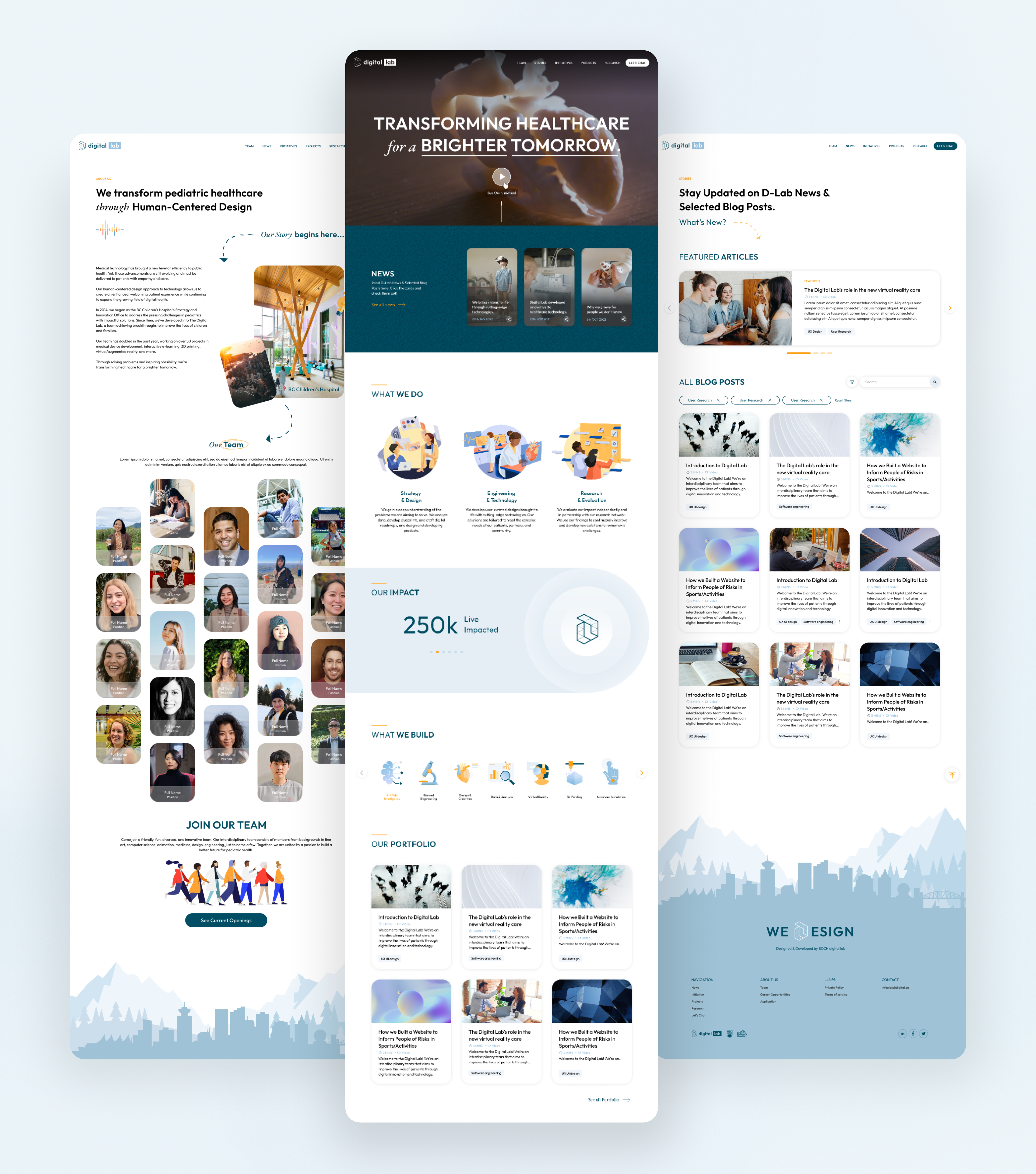
Our consistent UI/UX design is a reflection of our brand identity, with design elements such as the logo, font, and illustration consistently applied to every page and detail. Our focus on design consistency helps to establish brand recognition and reinforces our brand identity. In addition, we prioritized responsiveness to ensure that our design is optimized for all devices, from mobile to large screens. By doing so, we aim to provide a seamless and engaging user experience, regardless of the device being used.
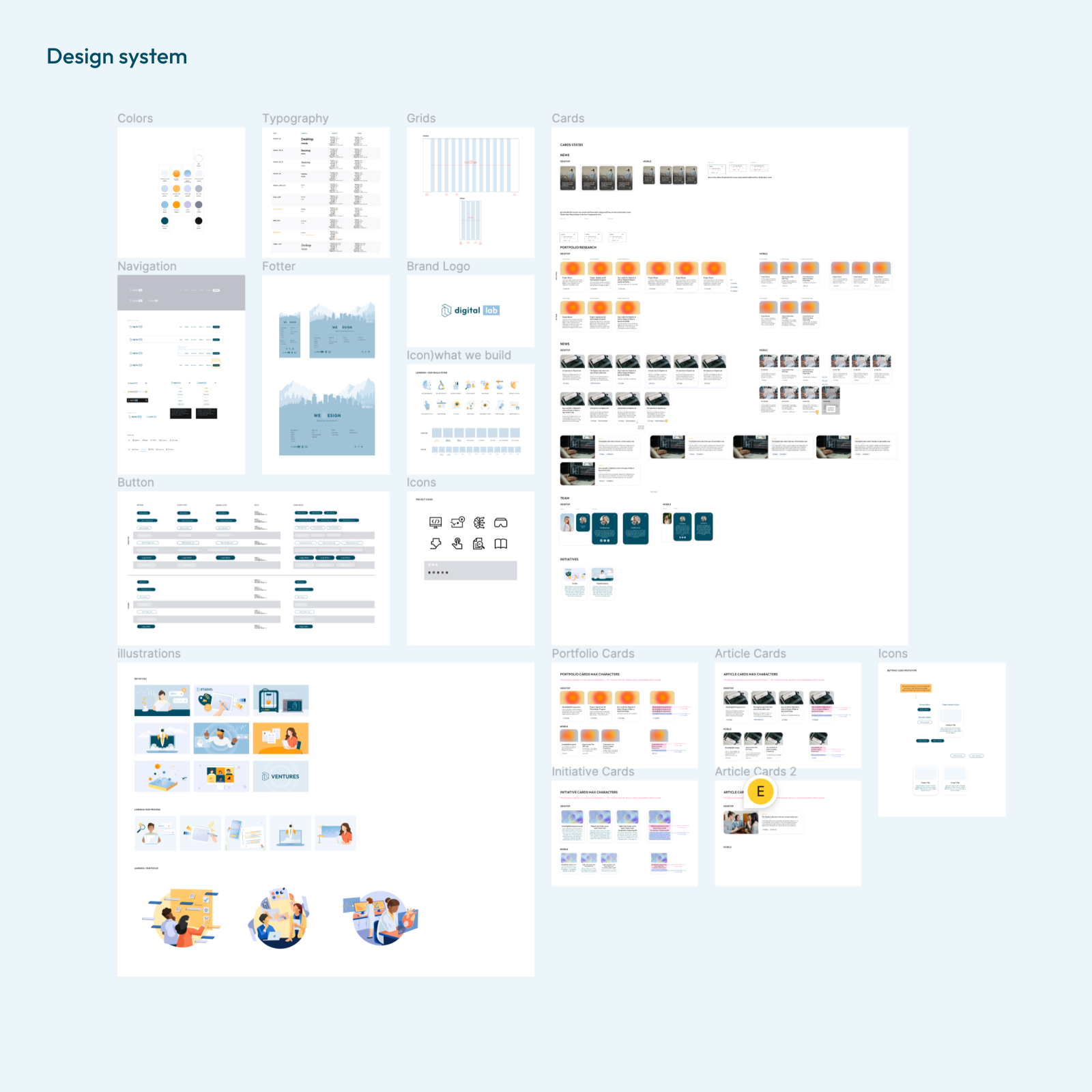
Design System & Style guide
Additionally, we created a consistent and systematic design style guide. This style guide improved communication with the development team and provided the design team with the opportunity to refine the design system with greater attention to detail.
